Greetings!
For today’s publication I decided to take a different approach and go to another direction, rather than talking about music or songs like I usually do. As a person who specializes in media industry and PR, I would like to emphasize on the extreme importance of the logotype – or logo (which is the abbreviation) when it comes to promotion, establishing individuality and gaining recognition and respect from the public. Every major organization or commercial enterprise has a unique and distinctive logo design, which people can almost instantly identify. In addition, individuals can also use a logo to boost their image and embody their character and individuality. Coming up with a logo design can be a very challenging task since this little graphic or word mark image is supposed to be special, easy to remember and at the same time represent an identity and differentiate the brand. Moreover, the logo of an organization or a person usually appears or numerous platforms – it turns into a signature and a face.
As I already said designing a logo or even coming with an idea of a cool and rather unique logo can be a very difficult task. However, numerous rock bands managed to create a distinctive logo which carries their spirit and tells something about them to the fans. I am sure that many of you guys are already thinking or have a rock band logo in mind – they are that memorable! Band logos are used in numerous ways – mostly on T-Shirts, albums, mugs and all kinds of merchandise. It is rare to see a picture of the band or the musician on a T-Shirt for example – usually we see the logo of the band. Thus, when we, the fans, wear it we experience the satisfaction of identifying with the band and being part of them.
To me personally, the 70s and the 80s was the golden age of band logos – I believe back then, musicians (especially hard rock/glam rock/heavy metal bands) were putting much more effort into creating beautiful and memorable logos for their band, compared to today. Bottom line is, every band is different and has an image. Thus, the way this distinctive image is crafted, packaged and delivered is beyond important! I came up with the idea of this publication a few days ago when I was looking at Led Zeppelin’s logo design and wondered if people really know what those symbols mean. I believe people have seen and are aware of such iconic rock band logos but may not be so familiar with the meaning behind them. That’s why I decided to make this post – it is going to be rather informative but I still will analyze and give my opinions. I hope you’ll enjoy and learn something new! So here there are – some of the most famous rock band logos!

The Rolling Stones

I just had to start with Rolling Stones – the big red mouth is probably the most memorable and widely recognizable band logos ever! The “Tongue and Lips” logo, which some have shortened to just “Hot Lips”, was created in 1970 by British graphic designer John Pasche. Interesting fact – the 24 year old (back then) John accepted only £50 (about $77) to come up with a design for the band. Originally, Mick Jagger wanted a logo resembling Kali – the Hindu goddess of energy. The goddess is usually portrayed with a large mouth and her tongue sticking out, however Pasche found a much bigger inspiration in Jagger himself. “I went into this sort of wood-paneled boardroom and there he was,” Pasche said. “Face-to-face with him, the first thing you were aware of was the size of his lips and mouth.” So at the end, it was purposefully created to resemble Mick Jagger’s mouth! So cool, right?
Led Zeppelin

“After all this crap that we’d had with the critics, I put it to everybody else that it’d be a good idea to put out something totally anonymous. At first I wanted just one symbol on it, but then it was decided that since it was our fourth album and there were four of us, we could each choose our own symbol. I designed mine and everyone else had their own reasons for using the symbols that they used,” – Jimmy Paige.
I specifically chose the logo with the symbols from the epic Led Zeppelin IV album, because many people don’t really know what they stand for or at least why where they placed there.
Drummer John Bonham’s symbol consists of three interlocking rings, which represent the mother, the father and the child. The symbol was chosen from Rudolf Koch’s Book of Signs.
Bassist John Paul Jones’ symbol was also chosen from the same book. It resembles a circle intersecting 3 vesica pisces (a triquetra) and it symbolizes a person who has confidence and competence.
Singer Robert Plant’s symbol is a feather inside a circle and was designed by him. The feather is an emblem of a writer (ie song lyrics) and also it is based on the lost civilizations and continent of Mu.
Jimmy Paige designed his own symbol and it is often referred as “ZoSo”. He never publically explained or stated what the true meaning behind the symbol is, however it was discovered that it dates back to at least 1557 and it represents Saturn.
There is also a fifth and smaller symbol, chose by vocalist Sandy Denny for her contribution to the “The Battle of Evermore“ song. It is an old Christian symbol for the Godhead.
Guns n Roses

One of the most recognizable logos in history! To me, personally, this is also one of the most beautiful rock band logos ever! That is why I will just focus on this one for now and won’t talk about the skull logo (which is also very famous by the way). It has poetic, sensitive and romantic side, as well as a violent and a bad one. The logo itself consists of two revolvers and roses with thorns wrapped around the guns. Many people also miss the fact that the back view – the brass ring with the silver primer in the middle, behind the guns and the roses is actually a bullet casing. Pretty interesting, right? Also, for those of you who don’t know why exactly guns and roses – the name of the band is a combination of the last names of Tracii Guns and Axl Rose. It is also a reference to their previous bands – Hollywood Rose and LA Guns.
The Ramones

Ah, the Ramones! This is probably one of my most favourite band logos (and bands as a matter of fact) of all time! It was designed by Arturo Vega and many people say that he basically “put the seal on their success”. Interesting fact – he was not only their “creative director” and archivist but also their very good friend – he is sometimes considered as the “fifth ramone”. Instead of trying to explain it with my own words, I would rather quote the designer himself talking about his ideas and motive behind the infamous seal logo. “I saw them as the ultimate all-American band. To me, they reflected the American character in general. I thought the great seal of the president of the United States would be perfect for the Ramones, with the eagle holding arrows – to symbolise strength and the aggression that would be used against whoever dares to attack us – and an olive branch, offered to those who want to be friendly. But we decided to change it a little bit. Instead of the olive branch, we had an apple tree branch, since the Ramones were American as apple pie. And since Johnny was such a baseball fanatic, we had the eagle hold a baseball bat instead of the arrows,” said Arturo Vega.
Queen

Queen! The infamous band logo was designed by Freddie Mercury shortly before the official release of their debut album. The logo illustrates the zodiac signs of all four members of the band – two lions for Leo (Deacon and Taylor), a crab for Cancer (May), and two fairies for Virgo (Mercury). The two lions are embracing the letter Q which also has a crown inside of it. The logo itself has a very strong resemblance to the Royal coat of arms of the United Kingdom. It is very pictorial and colourful – that’s the beauty of it! Honestly to me it is a bit too much for a logo – but then again – it’s Freddie and Queen we are talking about! The logo has to be as majestic and pompous as possible!
Van Halen


It is because I love Van Halen so much that I decided to show the two distinctive logos of the band – from the David and Sammy period. Interesting fact, before the first logo they had a few not so good ones and definitely not worth mentioning.
These logos – and especially the second one, are topping my list for most favourite band logos. I like simple but powerful and memorable designs and I feel like this one delivered it in the best way possible. The logos consist of the initials of the band name – V and H. The first logo was introduced in 1978 and the second one in 1986 when Sammy Hagar became the new lead vocalist of the band. With the new frontman, the logo changed just a little – it became more 3D-ish and the wings on both sides of the initials were transformed into rings to show the notable change in Van Halen’s lineup. The iconic winged Van Halen logo was designed by Dave Bhang in 1978. He also drew up a new cover for their first album (since the initial proposal from Warner Brothers was declined by the members).
AC/DC

In my opinion this is also one of the greatest examples of how a logo can become such an important part of a band’s identity! I am sure there’s not a single rock fan in the world who doesn’t know or haven’t seen this logo at least once in their lives. This is not a publication dedicated to the meaning behind band’s names, however in this case I need to mention the relationship between the logo and the name of the band. AC/DC is an abbreviation meaning “alternating current/direct current” electricity. Malcolm and Angus Young came up with the idea after their sister (Margaret Young) saw the initials on a sewing machine. It somehow suited perfectly to their raw energy and powerful live performances –that is also the reason why there’s a lightning bolt between AC and DC. The logo was designed in 1977 by Gerard Huerta and it first appeared on the international version of their album Let There Be Rock.
Bon Jovi

Just like Guns n Roses’ logo – I think this is also one of the most beautiful rock band logos of all time. Once again, we see a combination of two distinctive elements – a heart and a dagger. It is also a famous design for tattoos. There is no specific information about what exactly is the true meaning behind the logo, however once thing is for sure – when people are in love, they feel pain. It focuses on sensitivity, heartbreak and romance and has some gothic elements which make it even more remarkable and loved by many rock fans. The logo was first introduced for the band’s “New Jersey” tour merchandise and after that it just stuck and became one of the most memorable logos ever.
Aerosmith

It is a very beautiful logo perfectly suited for rockstars such as Aerosmith. It was designed by Ray Tabano, who was a member of the original Aerosmith lineup before being replaced by Brad Whitford. The logo first appeared in 1974 on the album “Get your wings”. It is very stylish, black and white logo with a large letter “A” that spreads its wings on the background. There are also other important elements such as a little star and the wings – which symbolize freedom and movement. Also, there’s a circle around the letter “A”, which sort of reminds us about the famous anarchy symbol.
The Doors

This logo just screams “60s”! It is very simple and it includes only the name of the band. I think it is one of the perfect logos to use on T-shirts or other kinds of merchandise – it stands out and it is very easy to read. Firstly, there is a tiny but very essential “the” on top of the name which uses the typical psychedelic typeface of the 60s. Also, the two “O”s are split in the middle and resemble pills – hmm…I wonder why…? The logo itself was designed by an Elektra Records assistant and it first appeared on their 1967 debut album. This is a perfect example of how sometimes the simple logos are the best.
References:
P.S. I don’t own any audio or visual material used in this publication. All the rights and credits go to the owners and/publishers.
The publication expresses my personal opinion and in no way is trying to make a generalized statement. Please be kind and considerate when you read and/or comment.
Cheers~
Feel free to share this with your friends...
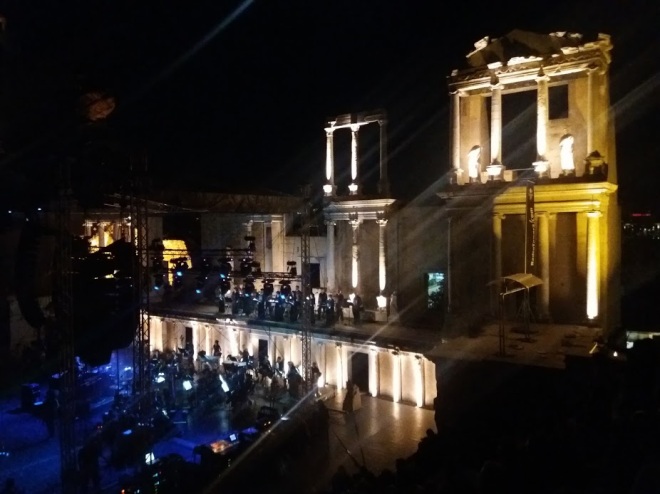
 “God of the Sun”, “Opus Maximus” and “Alive” quickly turned into one of the most played songs of 2017 on my playlist and the CD, which was given to me by someone very special, became one of my most prized possessions. A few weeks after the album was out I found out that a concert was scheduled in my hometown of Plovdiv, Bulgaria and that Sons of Apollo will be performing their debut album, alongside The Orchestra of Plovdiv State Opera. I vividly remember how I made plans with that special someone to go to that concert and a year later we actually went and I want to tell you all about it now! I was counting the days till the concert because I knew that it wasn’t going to be your ordinary local Saturday gig. They were going to perform at the Roman Theater in Plovdiv – this beautiful ancient venue full of atmosphere and character. Not just that, but a DVD from that concert will be released and they will be accompanied by the local orchestra, which makes me a very proud Bulgarian. After a long long waiting and almost a year of anticipation, the concert day finally came and I am so honored that I was part of this majestic piece of history.